Beyond PUMA: Taking energy insights further with Power BI
Data is only as valuable as the insights it delivers. At PUMA, we’ve built a tool that focuses on what matters most in energy management: bringing reliable utility & weather data into one place, applying robust baseline models, & calculating energy & cost savings with confidence.
But sometimes, the question isn’t "Do we have the right numbers?"
It's "How do we want to see them?"
PUMA as the engine
PUMA's real strength lies under the hood.
PUMA centralizes electricity, natural gas, & other utility data, pairs it with up-to-date weather information. Proven baseline modeling & savings calculations are applied, with results reviewed by certified staff. This “human-in-the-loop” approach ensures that automated analytics are supported by expert oversight.
The result is a system clients can trust. There’s no need to manually manage data, build models, or validate savings calculations. PUMA takes care of the heavy lifting, consistently & reliably.
When built-in dashboards & reports aren't enough
PUMA already offers customizable dashboards & a wide range of standard & custom reports. For many clients, these tools meet their needs perfectly.
However, there are situations where certain audiences, especially senior decision-makers & stakeholders, want something more tailored:
Advanced or highly customized visualizations & layouts
A single, high-level view that brings multiple metrics together
Interactive filtering across multiple dimensions
Dashboards aligned with corporate branding & visual standards
The data & calculations already exist in PUMA. What’s sometimes missing is the flexibility to present them in exactly the way a specific audience expects.
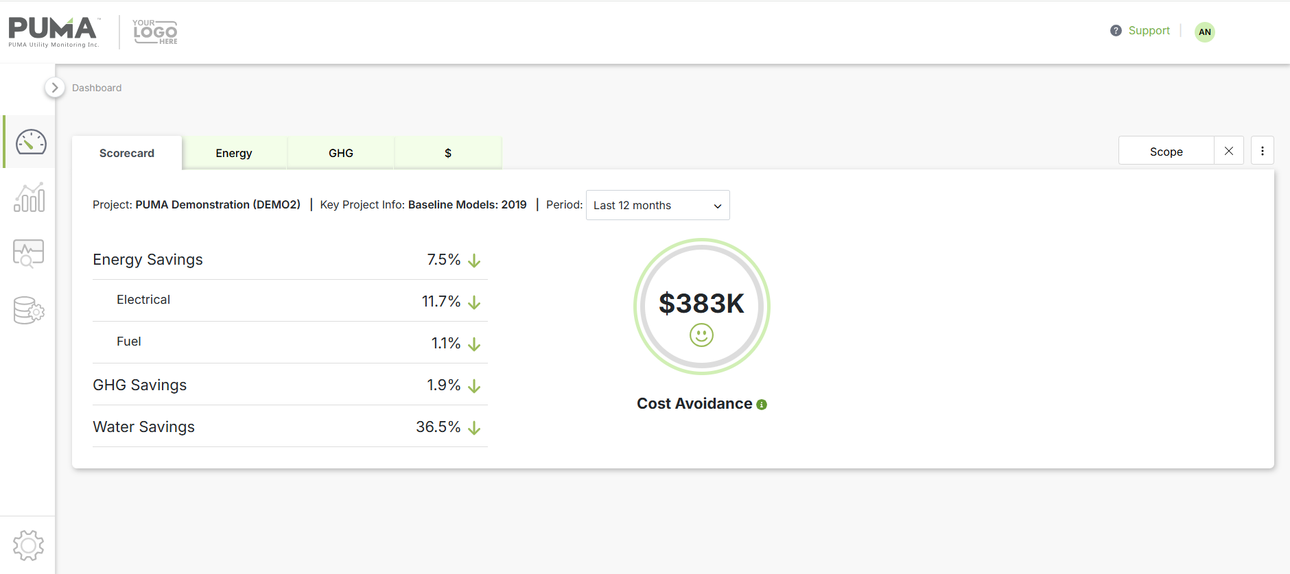
PUMA's built-in dashboard — Scorecard
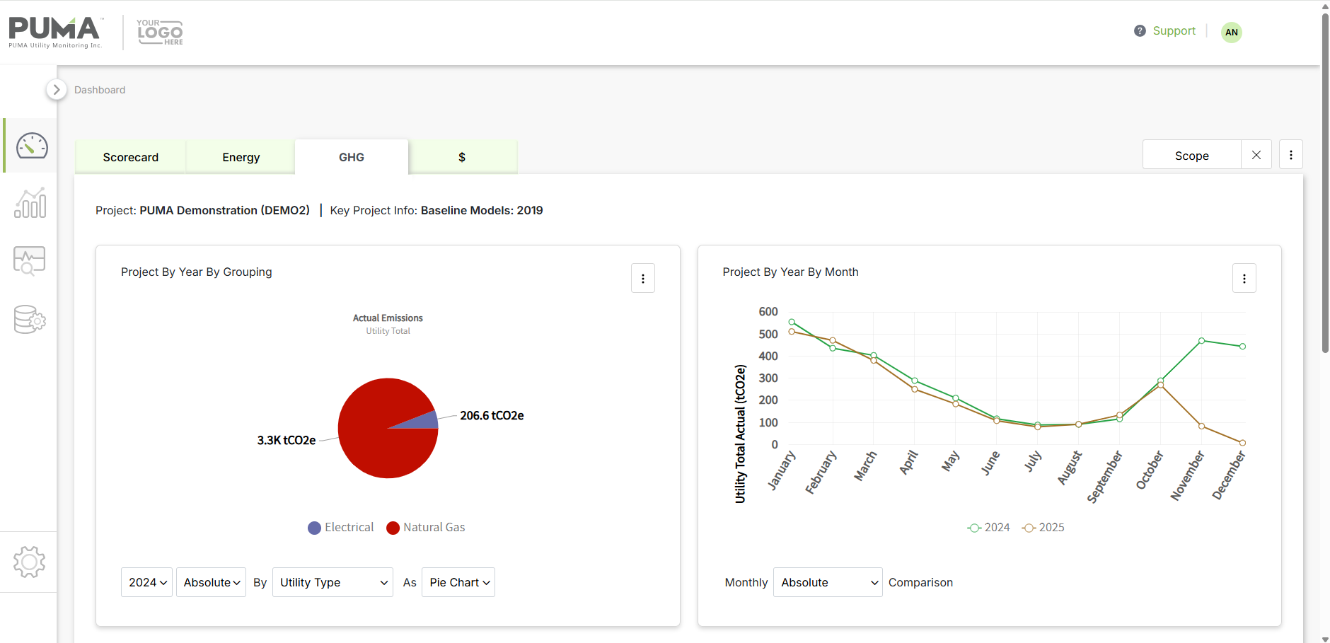
PUMA's built-in dashboard — GHG
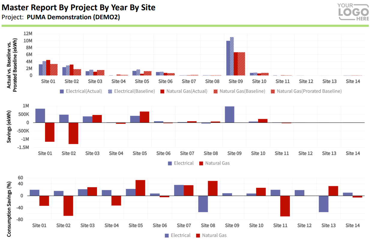
Custom report generated in PUMA
Extending PUMA with Power BI
This is where tools like Power BI complement PUMA perfectly.
PUMA remains the source of truth. It does the heavy lifting: data collection, baseline modeling, & savings calculations. The key metrics are then exported from PUMA reports & brought into Power BI, where the focus shifts to visualization, interactivity, & storytelling.
With Power BI, we can:
Create more refined & customized visuals
Combine metrics that normally live in separate PUMA reports
Create highly interactive views with filters, rankings, & drill-downs
Design dashboards that match corporate branding & executive preferences
The numbers stay trusted. The visuals get a boost.
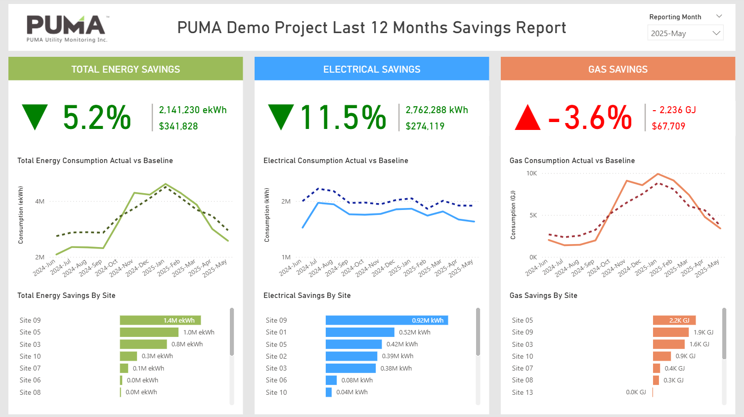
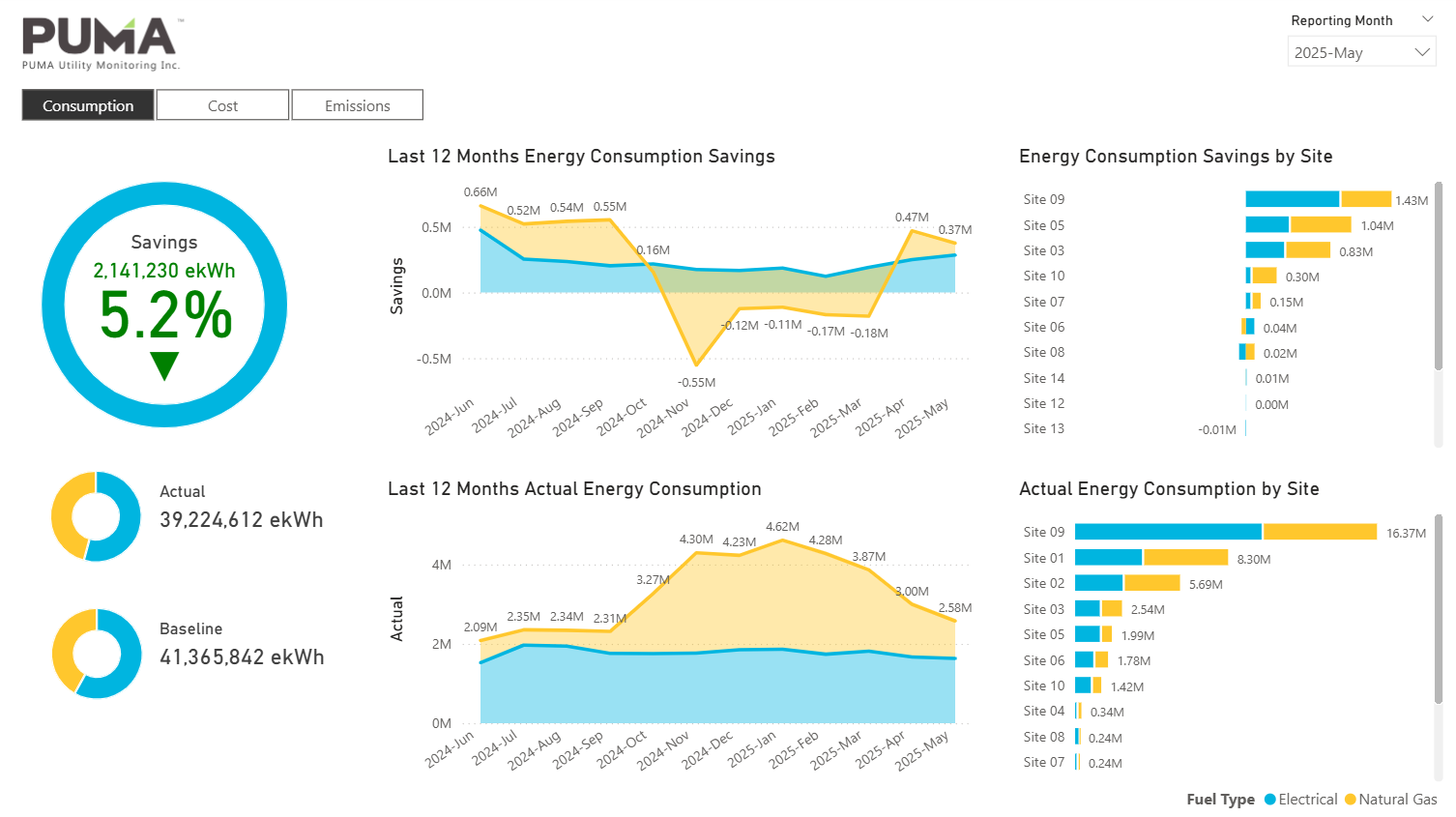
Power BI custom dashboard using data from PUMA reports — Sample design 1
Power BI custom dashboard using data from PUMA reports — Sample design 2
From insights to action
The goal isn't just better-looking dashboards. It's clearer conversations & faster decisions.
When savings, trends, & site performance are easy to see & compare, stakeholders spend less time interpreting data & more time acting on it. That’s when energy analytics start driving real operational & strategic value.
By going beyond PUMA & integrating with tools like Power BI, we’re not working around limitations - we're building on PUMA's strengths & extending them. The result is energy data that remains accurate & trusted, while becoming more engaging, flexible, & impactful for every audience that relies on it.